Quick guide to Windows Phone 8 Icons
Windows Phone pioneered the ‘Metro’ design language, the popular, iconic user interface paradigm used by thousands of apps to give end users a common basis from which to interact with their devices.
The Windows Phone design philosophy is exemplified by clean, uncluttered app screens that operate quickly, minimize typing, and surface new info automatically. Interactions happen directly with content, and visual elements have great fit and finish. You have the opportunity to use the phone for what it’s best suited for — apps for the mobile lifestyle.
Information delivery is the primary goal, not the wrapper around it. Adopting the infographic approach will help you optimize the user experience on Windows Phone.
Speak without words. Great visuals define not only how your app looks, but how it feels and comes alive through animation and motion. Your choice of color palette, icon, and artwork are just a few examples of this visual language.
All apps have their own unique identity, so explore the visual directions you can take with your app. Let the content guide the look and feel; don’t let the look dictate your content.
Standard Windows 8 Icon Sizes
Download these Icon templates for Windows Phone 8 to create pixel-perfect layouts for Windows Phone. These templates showcase many controls that are a part of the Windows Phone SDK. These additional templates are included to help designers and developers maintain a consistent look and feel across apps for system controls that developers want to mimic.
In App Assets
App Bar Buttons WVGA: 48x48px circle with 26x26px icon |
Applies to: Windows Phone 8 | Windows Phone OS 7.1
The default app bar is a row of icon buttons and an ellipsis along the bottom of the phone’s screen. Use icon buttons for the primary, most common actions in your app. Some actions are difficult to convey clearly with an icon. If this is the case, consider using a menu item instead.
The following illustration shows an example of an app bar icons.
Icon button best practices:
- Icon images should be 48×48 pixels in size. The foreground graphic for the button should fit in a 26×26 area in the center of the image so that it does not overlap the circle.
- The circle displayed on each button is drawn by the app bar and should not be included in the source image.
- Icon images should use a white foreground on a transparent background using an alpha channel. Windows Phone automatically colors the icon according to the theme selection (light or dark), and colored icons can cause this effect to display unpredictably.
- Do not create a button that navigates backward in the page stack. All Windows Phones have a dedicated hardware Back button that should be used for backward navigation.
- Keep Icon Button labels as short as possible. If the language of the device is English, labels appear on only one line, and are truncated if necessary.
- Choose icons that have clear meanings when the phone is rotated. When the phone is in landscape orientation, the app bar appears on the side of the screen vertically. The icon buttons are rotated so that they appear upright to the user. It is possible for icon meanings to be confused when this occurs, particularly if two of the icons are mirror images of each other such as << and >>.
Want a new Windows 8 or 10 tile icon?
We can bring your software up to date with clean, contemporary Windows tile icons
Start Screen
| | Application Icon ApplicationIcon.psdUsed for all resolutions: 99x99px | 14px padding |
The following illustration shows an example of application icons.
Applies to: Windows Phone 8 only
The iconic template displays a small image in the center of the Tile, and incorporates Windows Phone design principles.
The following image describes sizing information for the iconic Tile template.
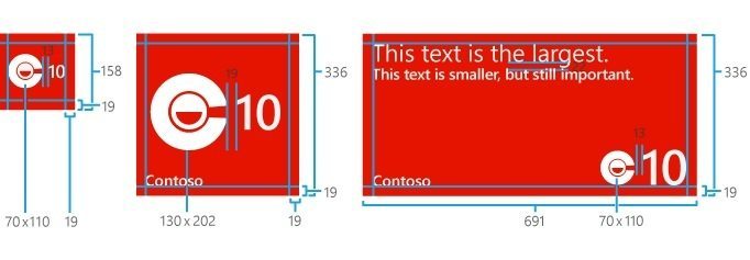 To ensure proper scalability across resolutions, keep these points in mind:
- The Iconic Tile template requires that you supply two images; they are used as follows:
- SmallIconImage:
- This image is used when the tile is resized to small, or when the tile is wide and has some content strings on it.
- The maximum size of this image is 110 pixels by 110 pixels, but the recommended “best fit” dimensions are 70 pixels by 110 pixels.
- IconImage:
- This image is used when the tile is resized to medium, or when the tile is wide and has no content strings on it and may or may not have a count.
- The maximum size of this image is 202 pixels by 202 pixels, but the recommended “best fit” dimensions are 130 pixels by 202 pixels.
- SmallIconImage:
- Always pad vertically with a transparent buffer to the full size of the asset you’re creating. If the white pixels in your medium or large image are only 130 pixels high, pad the top and bottom of the icon out to 202 pixels high with a transparent buffer. Remember to keep the image centered.
- Always crop tight on the horizontal plane – that is, if your image is 130 pixels wide, crop it there and don’t pad the horizontal plane with a transparent buffer. Doing so will push the count too far away from the image.
- Lay out your large icon image first and, if possible, scale it down for the small icon image. For example, if you have a Tile that’s 130 pixels wide by 202 pixels tall, set the small aspect ratio to 110 pixels tall and approximately 70 pixels wide.
The flip Tile template flips from front to back. Because the Tile flips at a random interval, we recommend you put your most important info on the front and lighter info on the back.
The cycle Tile template cycles through between one and nine images.
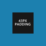 | Small Flip/Cycle Tile Used for all resolutions: 159x159px | 43px padding |
 | Medium Flip/Cycle Tile
Used for all resolutions: 336x336px | 101px padding |
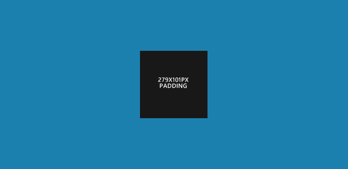 | Large Flip/Cycle Tile Used for all resolutions: 691×336 | 279x101px padding |
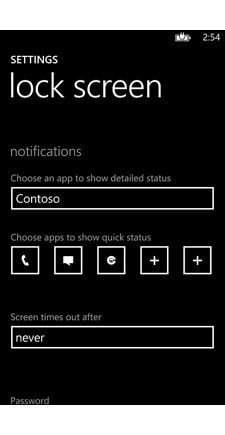
Lock Screen
Lock Icon Used for all resolutions: 38x38px |
Create a 38 x 38 pixel PNG image that will identify your app on the lock screen. The image must contain only white pixels plus some level of transparency.
The lock screen’s app icon, count, and text are pulled directly from the app’s default Tile.
Lens
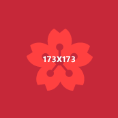 | Lens Icon WVGA: 173x173px 720p: 259x259px WXGA: 277x277px |
Applies to: Windows Phone 8 only
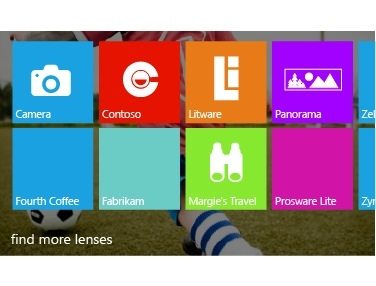
In Windows Phone 8, you can create a camera app called a lens. A lens opens from the built-in camera app and launches right into a viewfinder experience to help the user capture the moment. But not all lenses stop at capturing photos. Some lenses, called rich media lenses, provide a unique experience for viewing or editing photography. Other lenses use the camera as a gateway to a different experience. For example, a bar code reader lens might use the camera to scan a bar code and then display related data from the local folder.
The Lens button opens the lens picker, in which a user can choose a lens for the camera. The lens picker displays a list of apps in the Windows Phone Store that support lenses. The following figure shows the lens picker, with some example lenses.
File Handlers
Small File Handler Icon Used for all resolutions: 33x33px |
 | Medium File Handler Icon Used for all resolutions: 69x69px |
 | Large File Handler Icon Used for all resolutions: 179x179px |
Official Design guidelines for Windows Phone


its very nice article, so helpfull. thanks for information
Thank you, this is great! Microsoft needs documentation like this: clear and to the point.
Very informative. Thanks.
Nice information, but allow me to make a small correction: Windows Phone 8 ApplicationBar icons are supposed to be 76×76.
48×48 is for WP7 devices and you can use them in WP8 too, but they will be upscaled and look really bad!
Hi Pedro, thanks for the heads up, much appreciated!
Adam