Android Icon Sizes Made Simple (2025 Guide)
Need to know the correct Android icon sizes for your app?
Whether you’re targeting legacy Android devices or the latest adaptive icon requirements, this guide covers everything in one place. We’ve merged years of custom icons design experience with Google’s current Android Icon Size guidelines to help you get your icons pixel-perfect across all Android versions.
If you’re new here, we’re Creative Freedom, a specialist icon design company working with mobile and software developers to craft beautiful, scalable icons that just work.
Jump to a Section:
- 1️⃣ Adaptive Icons (Android 8.0+)
- 2️⃣ Legacy Launcher Icons (Android 2.0–7.1)
- 3️⃣ Notification Icon Sizes
- 4️⃣ Google Play Store Icon
- 5️⃣ Quick Reference Table
- 6️⃣ Free Resources & Tools
- 7️⃣ Design Tips
- 8️⃣ FAQ
1️⃣ Adaptive Android Icons (Android 8.0+)
Adaptive App Icons were introduced in Android 8.0 (Oreo) to ensure your app icon looks great across different device shapes and themes. Instead of a single image, you now supply two layers: a foreground and a background. Android applies shape masks (circle, square, squircle, etc.) to these layers automatically.
Foreground and background layers from Android Adaptive Icon guidelines
✅ How to Prepare Adaptive Icons
- Create two layers — one for the foreground, one for the background.
- Use vector formats where possible (
.xml), for better scaling and smaller APK size. PNGs at 432×432 px (108 dp @ xxxhdpi) are acceptable if needed. - Design within the safe zone — keep your key icon artwork within a 66 × 66 dp area. The outer edges may be clipped depending on the mask.
- Save files to the appropriate
res/mipmap-*folders in your Android project.
If you’re unfamiliar with vector tools, consider using Figma (free), Inkscape (open-source), or Adobe Illustrator (pro).
Example: circular mask applied to an adaptive icon
Android applies different shape masks — your icon adapts to each one
📁 Filename & Folder Example
res/mipmap-anydpi-v26/ic_launcher.xmlres/mipmap-xxxhdpi/ic_launcher_foreground.pngres/mipmap-xxxhdpi/ic_launcher_background.png
🧩 Sample XML
<adaptive-icon xmlns:android="http://schemas.android.com/apk/res/android">
  <background android:drawable="@mipmap/ic_launcher_background"/>
  <foreground android:drawable="@mipmap/ic_launcher_foreground"/>
</adaptive-icon>
Android Studio’s built-in Asset Studio can generate these layers for you, or you can create them manually if you prefer full design control.
2️⃣ Legacy Android App Icon Sizes
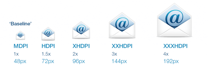
Before adaptive icons were introduced in Android 8.0 (Oreo), developers had to create separate bitmap icons for each screen density. These “legacy” icons are still important if you’re targeting older Android versions or ensuring backward compatibility.
Each density required a different pixel size, all based around a core 48×48dp icon. These PNGs were placed in specific folders within the project’s res/ directory structure.
| Folder | Resolution | Density |
|---|---|---|
mipmap-mdpi | 48×48 px | MDPI (baseline) |
mipmap-hdpi | 72×72 px | HDPI (1.5×) |
mipmap-xhdpi | 96×96 px | XHDPI (2×) |
mipmap-xxhdpi | 144×144 px | XXHDPI (3×) |
mipmap-xxxhdpi | 192×192 px | XXXHDPI (4×) |
📁 Example folder structure for legacy icons:
res/mipmap-mdpi/ic_launcher.pngres/mipmap-hdpi/ic_launcher.pngres/mipmap-xhdpi/ic_launcher.png- … and so on
💡 Legacy Icon Setup Tips
- Use clean, pixel-perfect PNGs at each resolution.
- Ensure visual consistency across sizes, small icons shouldn’t feel like shrunk-down versions.
- Match the Android Material Design style guidelines if targeting Android 5.0–7.1.1.
- Modern tools like Android Asset Studio can help automate this process.
Icons should be named consistently (e.g. ic_launcher.png) unless you are providing variants such as ic_launcher_round.png.
Although legacy support is declining, many apps still support Android 5.0+ where these sizes remain useful. It’s best practice to include these fallback icons unless your app explicitly targets Android 8.0+ and above.
3️⃣ Android Notification Icon Sizes
Notification icons are a special case. These appear in the status bar and notification shade and must follow strict guidelines to ensure clarity across devices and themes.
- Use a solid white icon on a transparent background (monochrome only).
- Recommended size: 24×24 dp rendered as 48×48 px (MDPI baseline).
- Place icons in
res/drawable-*folders according to density.
A run-down of all Legacy Android App Interface Icon Sizes
The following table shows the icon sizes needed for all Android icon types, for all screen densities.
| MDPI | HDPI | XHDPI | XXHDPI | XXXHDPI | |
| Scale | 1 x | 1.5 x | 2 x | 3 x | 4 x |
| DPI | 160 dpi | 240 dpi | 320 dpi | 480 dpi | 640 dpi |
| Launcher | 48 px | 72 px | 96 px | 144 px | 192 px |
| Action bar | 32 px | 48 px | 64 px | 96 px | 128 px |
| Small / Contextual | 16 px | 24 px | 32 px | 48 px | 64 px |
| Notification | 24 px | 36 px | 48 px | 72 px | 96 px |
Avoid gradients or drop shadows, Android automatically applies styling. If you include a full-colour icon, it may render poorly or be blocked entirely on newer versions.
Refer to Google’s latest notification design guidance.
4️⃣ Google Play Store Icon Requirements
Your app’s Play Store icon is different from the launcher or notification icons. This one only appears in the Google Play Store listings, search results, and featured placements, so it needs to stand out!
- Size: 512×512 px
- Format: 32-bit PNG with alpha
- File size: ≤1024KB
- Do not round corners or apply shadows — Google will mask the icon automatically.
You can use the same base artwork as your adaptive icon, but optimise it for presentation on high-res screens and varied backgrounds. Think of it as a mini billboard for your app.
Android Play Store Icon – 512×512 Pixels
5️⃣ Quick Reference: All Android App Launcher Icon Sizes
Use this table as a one-stop guide for both legacy and adaptive Android app icon dimensions renered as PNG files, including the foreground and background layers for adaptive icons and the full resolution required for each screen density.
📝 If you are using an XML vector file, remember the dimensions of the App Icon are 108×108 dp.
| Type | Density | Size (px) | Folder |
|---|---|---|---|
| Adaptive Foreground | XXXHDPI | 432×432 (108×108 dp) | res/mipmap-anydpi-v26 |
| Adaptive Background | XXXHDPI | 432×432 (108×108 dp) | res/mipmap-anydpi-v26 |
| Legacy Icon | MDPI | 48×48 | mipmap-mdpi |
| Legacy Icon | HDPI | 72×72 | mipmap-hdpi |
| Legacy Icon | XHDPI | 96×96 | mipmap-xhdpi |
| Legacy Icon | XXHDPI | 144×144 | mipmap-xxhdpi |
| Legacy Icon | XXXHDPI | 192×192 | mipmap-xxxhdpi |
Tip: Many developers use a single 432×432 icon and scale it down for legacy support, but results can appear blurry. Design each size carefully for best clarity, or hire a professional icon designer to help.
6️⃣ Free Resources & Android Icon Tools
To help streamline your icon export process, we’ve included a few resources:
- 🤖 Android’s Official Adaptive Icons Guide
- 🔥Android Jetpack Compose Quick Guides
- 🧰 Icon Maker Software Review
- 🎨 Custom Icon Design Services
Need help crafting a professional app icon? Talk to our team.
7️⃣ Design Tips for Better Android App Icons
Creating a great Android icon isn’t just about getting the size right, it’s about making your icon stand out on every screen, in every context. Here are a few key tips from our design team:
- Respect the Safe Zone: For adaptive icons, keep foreground artwork within a 66×66dp safe zone (on a 108×108dp canvas). Avoid placing important elements near the edge where they might be masked.
- Design for All Sizes: Don’t rely solely on scaling. Sharp lines and fine details often blur when downsized. Hand-tune your icons at smaller resolutions when possible.
- Mind the Contrast: Your icon will be shown on different backgrounds and themes (light/dark modes). Test it against varied backdrops to ensure it stays visible and legible.
- Unify Your Style: Consistency matters. Avoid mixing outline icons with shaded or 3D elements. Stick to one visual language across your app and brand assets.
- File Naming Matters: Use clear, Android-friendly names like
ic_launcher_foreground.pngandic_launcher_background.png. Place them in the appropriate/res/mipmap-*folders for best compatibility.
If you’re struggling with blurry icons or inconsistent visuals, you’re not alone. Our blog post Why Your Icons Look Blurry (and How to Fix It) goes deeper into how scaling impacts icon clarity, and what to do about it.
Need help getting your Android icons right? Start here.
8️⃣ Android Icons: Your Questions Answered
- 📱 Do I really need all the different icon sizes?
- Yes, Android devices come in a wide range of screen densities. Supplying icons for all required resolutions ensures your app looks sharp on every device.
- 🧩 What’s the difference between adaptive and legacy icons?
- Adaptive icons (Android 8.0+) support dynamic shapes, effects, and masking. Legacy icons (pre-8.0) are static PNGs designed to look consistent across older devices.
- 📏 Is dp the same as px?
- No, dp (density-independent pixels) is a virtual unit that helps standardise UI element sizes across devices with different screen densities. px refers to physical pixels. Designing in dp makes your app look more consistent across a range of Android devices.
- 🎨 Can I just scale my icon down in code?
- Not reliably. Scaling down often creates blurry or uneven icons. It’s better to supply correctly sized assets for each density to maintain visual clarity.
- 🗂️ Where do I put each icon size in my Android project?
- Place PNG files in the appropriate `res/mipmap-` folders. For example, use `res/mipmap-hdpi/ic_launcher.png` for the 72×72 version. Adaptive icons use foreground and background assets with the `.xml` wrapper in `res/mipmap-anydpi-v26/`.
- 💼 Can you help design my app icon?
- Absolutely. Our custom app icon design service delivers professional icons in every Android format, adaptive and legacy, ready to drop into your project.
Still have questions? We’re happy to help.

Great post! The visual examples really help clarify the different icon sizes and their uses. It’s so important for developers to get this right for a polished app. Thanks for making it simple!
You’re welcome. If you’d like to see anything else added or a similar post on another topic, let me know 🙂
Great breakdown of Android icon sizes! I’ve always found this topic a bit confusing, but your guide makes it so much clearer. Thank you for the detailed information and handy tips!
Great post! This icon size guide is incredibly helpful for both beginners and seasoned developers. It’s nice to have all the dimensions organized in one place. Thanks for simplifying the process!