The top 5 best app icon designs
In this post, we lay out 5 of our favourite app icon designs – from simplistic masterpieces to elaborate works of art, these app icon designs have become a firm favourite among design lovers everywhere.
For our list, we have chosen app icons that really stand out among the crowd, there’s just something about them that ticks all the right boxes, making other designers and brande green with envy.

1. Blek
If you’ve not heard of Blek , then where on earth have you been! Released in 2013, this beautifully functioning puzzle game was designed by two brothers – Denis and Davor Mikan. Described as a game that could only exist through touchscreen. But that’s enough about the game, what we’re hear to talk about is the app icon.
The Blek icon is minimalist in its execution, featuring a wavy “B” in white, similar to the many French Nouveau inspired fonts out there, offset by a black background. It’s alluring and sensual, befitting the intimacy of the game itself, which has a gentle, feminine sequence to it. With so many gaming app icons out there drenched in bold, primary colours, it’s a breath of sophisticated fresh air.
2. Grayout
Another game app icon, but this really does take the prize for being unique. Much like the design guys behind Blek, Grayout has gone with simplicity and sophistication over excessive imagery and colour. One of the few icon designs out there to successfully incorporate photography, Grayout uses a haunting rectangular cropped shot of a woman’s eyes, which really give it some emotional appeal.The eyes have a look of fright, which is tied in with the game itself, about a woman who’s trapped inside her own head. Rather than going for anything else, even naming the icon, it’s just the eyes centred on a slab of mint green. It conjures up thoughts of a prison, of being trapped somewhere you desperately want to get out of.

3. Instagram
Yes, there was a huge outcry in certain quarters when Instagram decided to ditch its three-dimensional, old instant camera inspired icon a few years back, but this design has really grown on us.
With echoes of its old design, the design team behind Instagram decided that it would keep the skeletal structure of the old and infuse it with something a little more arty, the white camera is set on top a rainbow palette, which is bold and confident.
This was a really risky change of direction for Instagram, but they sure did pull it off well.

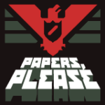
4. Papers, Please
Papers, Please is a game set in a stark and oppressive Communist regime, so what better than for the designers to capture the authoritarian nature of Communism in their app? Soviet propaganda has long been a favourite inspiration point for designers out there, and this design contains a bevy of historical inspiration and is one beauty of an app.

5. Assembly
Design geeks everywhere have heard of the Assembly app, even if they don’t want to admit it. This quirky little app allows users to create stickers, icons, scenes, and other graphics, using a fun and novel building-block approach.
The icon design is stunning, childlike yet grownup, silly yet sophisticated. It’s a dynamic set of coloured triangles, with quite a vintage 80’s vibe, like something you would see at the end of an ITV kids show from 1983.
Get the perfect App icon
Want your App to look great and increase sales?
A professionally designed app icon will tell your story at a glance, leading to more engagement in the App Store and more conversions.

