10 Most Common Fonts Featured in Iconic Logos
Why the right Font can help make Logos iconic
There are many different factors to keep in mind when choosing a font for your company’s logo. It must be appropriate to reach its intended audience, simple, memorable and timeless.
Yes, it must be timeless, allowing the company to use it for years to come. If you are looking for a font for your business, then taking a look at the fonts chosen by iconic brands may lead you in the right direction.

1. Gatorade
The Gatorade logo was created from the modern Slab Serif. Of course, designers tweaked the font, and it has even changed a little bit over the years.
The font for Gatorade was chosen because it has a masculine appearance allowing it to connect with the sport’s crowd. If your target audience is mostly made up of younger men, then you may want to consider this font as well.

2. Facebook
Mark Zuckerberg went looking for a font for Facebook in 2004 when no one had heard of the company yet. After consulting several designers, he chose the Klavika font because of its great flexibility and its modern look. The designers widened the c and connected the pieces on the k to produce this logo that is seen by most people every day.

3. Google
In 2015, Google introduced its new logo. It is based on the Futura font. One of the reasons that this font was chosen was its precise geometric measurements indicating that users can get precise answers by using Google.
Like most major corporations, however, designers for the company made some changes to the font including raising the crossbar on the G, adding balance by raising the bottom of the little gs and making the i shorter. These subtle changes to the font give it a more balanced appearance.

4. PayPal
When Matthew Carter was hired to design the PayPal logo, he chose the Verdana font. He changed it by making it bold and italicizing it. Other changes to the font include making the edges of all letters more round giving a softer appearance to the logo. He also made the letter squarer. Changes to the Verdana font may have been made so that customers would see the company as trustworthy and friendly.

5. Flickr
Another highly recognizable logo is the one used by Flickr. Unlike most companies who customize their fonts, this iconic font just uses the Frutiger font without any changes.

6. YouTube
p>Over 1 billion people see the font used by YouTube each month. The company chose to use Alternate Gothic No. 2 for their iconic font. They made very few changes to this font except for spreading the words apart a little more and adding the red box around the word tube.

7. Twitter
While Twitter changed its font to Gotham for a while for desktop users, the company has returned to using Helvetica Neue for all users. Going back to the original font for all users shows business owners that they should never be afraid to try something new even if they have to admit that it did not work.

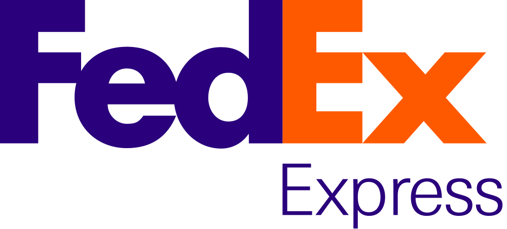
8. FedEx
When FedEx wanted a new logo, they wanted a bold one that would let customers know that they were dealing with a company who was determined to do things in a new way. Therefore, their font is a combination of Univers 67 and Futura Bold. Playing with the two fonts allowed the designer to create FedEx’s iconic arrow in their logo.

9. Wendy’s
The owners of Wendy’s wanted a new sophisticated logo in 2010. Therefore, they chose the Verlag. Asiago. They used this font in many different places including signage in the stores, their website and many other places.

10. Nike
For many years, Nike has used the company slogan “Just Do It.” They chose the Futura font for this slogan. Designer Paul Renner condensed the font making it extraordinarily black for their slogan.
Make sure to follow some basic design rules if you choose to design your own company logo. Choose two fonts at most. Remember that the best fonts have been around for a while as they are likely to be around for many years to come. Avoid relying on colors to create the logo because this allows greater flexibility in the future.

