This article looks at how to keep your Illustrator files ‘fully’ vector and still create an attractive vector Drop Shadow effect.
For any icon designer it’s a straight-forward process to create a nice, feathered, transparent drop shadow in Photoshop, and the same process can be followed in Illustrator too by using the ‘Effect -> Stylize -> Drop Shadow’ command. However, I find the effect can be a little clunky to work with because the shadow effect is rendered as a raster object; so you lose the benefit of scalable vector loveliness when the file is opened anywhere except in its native Illustrator. In other words, the vector object will scale perfectly but the raster drop shadow will not, giving a pixelated, ‘blocky-looking’ effect when zoomed in or enlarged.
Maintaining a completely vector file when designing icons is particularly important when the client wishes to use them for Print and therefore scale them up. Another scenario is for software or applications that can only utilise vector artwork, such as the XAML Icon format. This was the case for a recent custom icon design project that I had the good fortune to be involved with, which required XAML vector custom icons, and which partially inspired this post.
 To achieve a vector drop shadow, I use Illustrator’s ‘Blend’ effect, which essentially uses two paths and blends between them using a number of specified parameters. The simple example below shows a green stroked circle blending to a larger blue stroked square in five steps.
This is how blend works, much as the vector animation software Flash, creates a tween. It should be possible to see how this effect could work for a feathered drop shadow. Although it will never be as smooth and buttery as a Photoshop drop shadow, it certainly can be close and it should look a lot better than a hard-edged shadow (unless that is the desired effect, of course). An elliptical feathered shadow is very simple to create and can work very well for many applications and icon styles. Here is how to create one…

1. Using the ellipse tool, draw a ‘flattish’ ellipse, fill it black and make sure it has no stroke.

2. Copy+paste in place the ellipse, and proportionally reduce the size a little, using alt+shift and grabbing the handles.

3. Select the larger ellipse and set the transparency to ‘0%’

Need an expert icon designer?
Finding the right icon designer doesn't have to be difficult
4. Select both ellipses and create a blend; Object>Blend>Make. You should have a blend that contains a single step between the two original ellipses. We need to add some more…

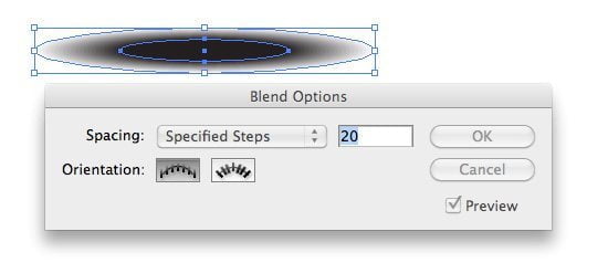
5. To edit the Blend; Object ->Blend ->Blend Options… Here you’ll see a number of options. I use ‘specified steps’ and generally use anywhere from 20 to 50, but each project may call for different values. Click OK.

6. You now have a feathered drop shadow with vector loveliness!
Note that you can easily offset the smaller, darker ellipse to give more feathering on one side, you can squash the shape to suit, add more steps (in Blend Options) and alter the colours and/or transparency. To edit the ellipses relative positions to each other or tweak the colours, first you must double-click the blend group, this will isolate the two initial ellipses so that you can move them independently of each other and alter the colours and sizes, etc. Have a play with the options, colours and transparency levels to achieve the best results.
Here are some examples of it in use…

You can also take on more complex shapes with a little tweaking to get even closer to the ‘Photoshop drop shadow’ effect. Here are some examples from the custom icon project I mentioned earlier, which uses XAML scalable vector icons.


The two lehater briefcases icons look good. They would fit in great on my website, where I, oddly enough, sell Mens Leather Briefcases. I have found other tutorials on Photoshop graphics that I have used many of my websites. What I discovered is, that they don’t always work exactly as shown. You may have to tweak them a little, but that is usually no problem.
I’ve worked in Photoshop for many years, but never really touched Illustrator until two days ago. I was never really sure how to clip out parts of drop shadows (to give an overlapped effect without shadows spilling outside of shapes). Thanks to your tutorial, I was able to achieve the effect I wanted. Thanks!
This is not that easy for irregular shapes: the shadow won’t match. Besides, I finally found this option:
Effect>Document Raster Effect Setting, and setting the resolution to High.
Whoohoo!
Great tip, thanks for sharing!
Yep, but this is a raster effect in Illustrator. Great if you are working at a fixed maximum size, but not ideal if your icon or artwork needs to scale.
Many many thanks for sharing such a valuable tips. I really appreciate your nice explanation. I will certainly dig it and personally suggest to my friends. I’m sure they’ll be benefited from this website.